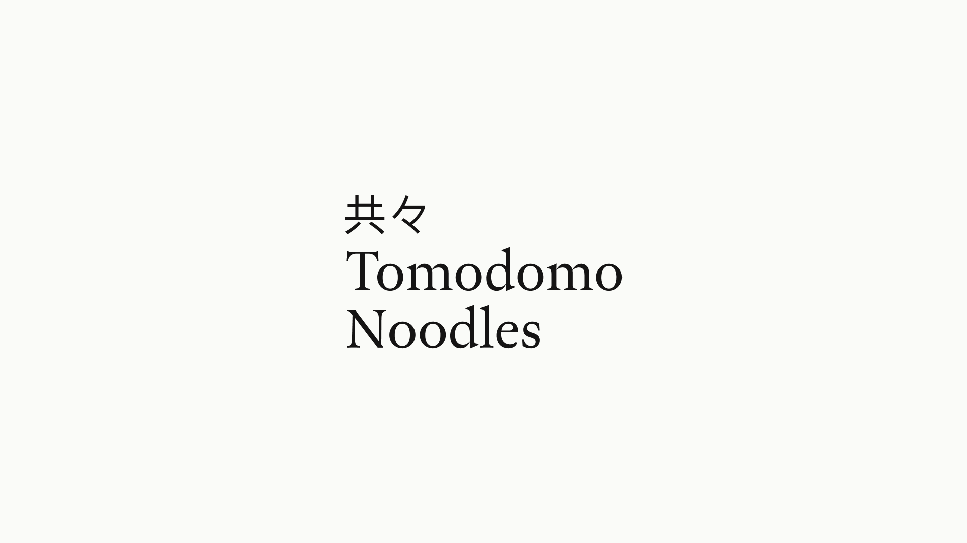
Tomodomo
Studio AntiRole illustrator, designer
Tomodomo is an Oslo based restaurant specialising in handmade Japanese noodles made from good quality local Scandinavian ingredients. The founders (who are also chefs and work closely in the kitchen) wanted our help with a name change and rebrand that focuses on direct, human touch, mirrors their artisanal craft and collaborative spirit.
To stand out in Oslo’s increasingly competitive restaurant market, our goal was to attract an audience that values authenticity over convenience through a personality that feels sophisticated yet charmingly and accessible. Their name was changed to Tomodomo, which translates to ‘being together with friends’ - the perfect atmosphere for enjoying a bowl of handcrafted noodles.
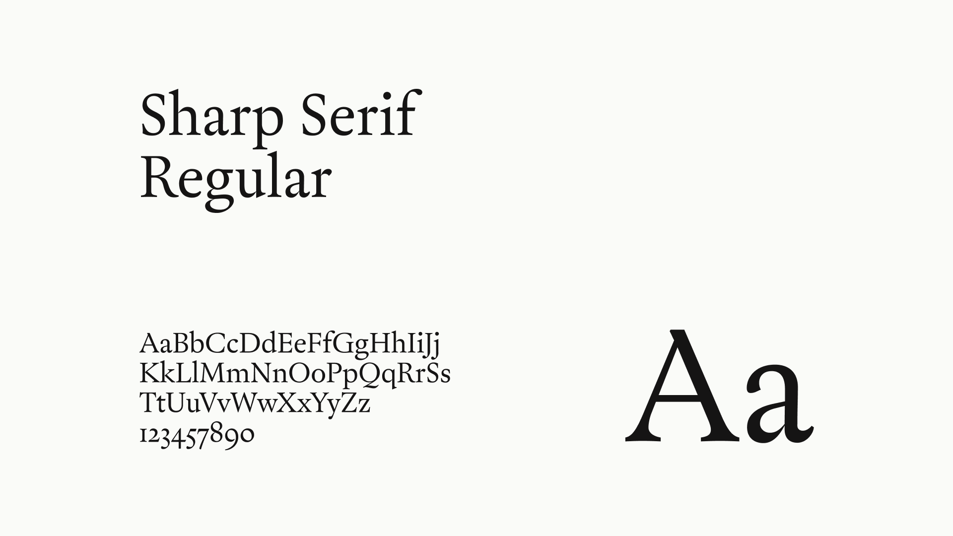
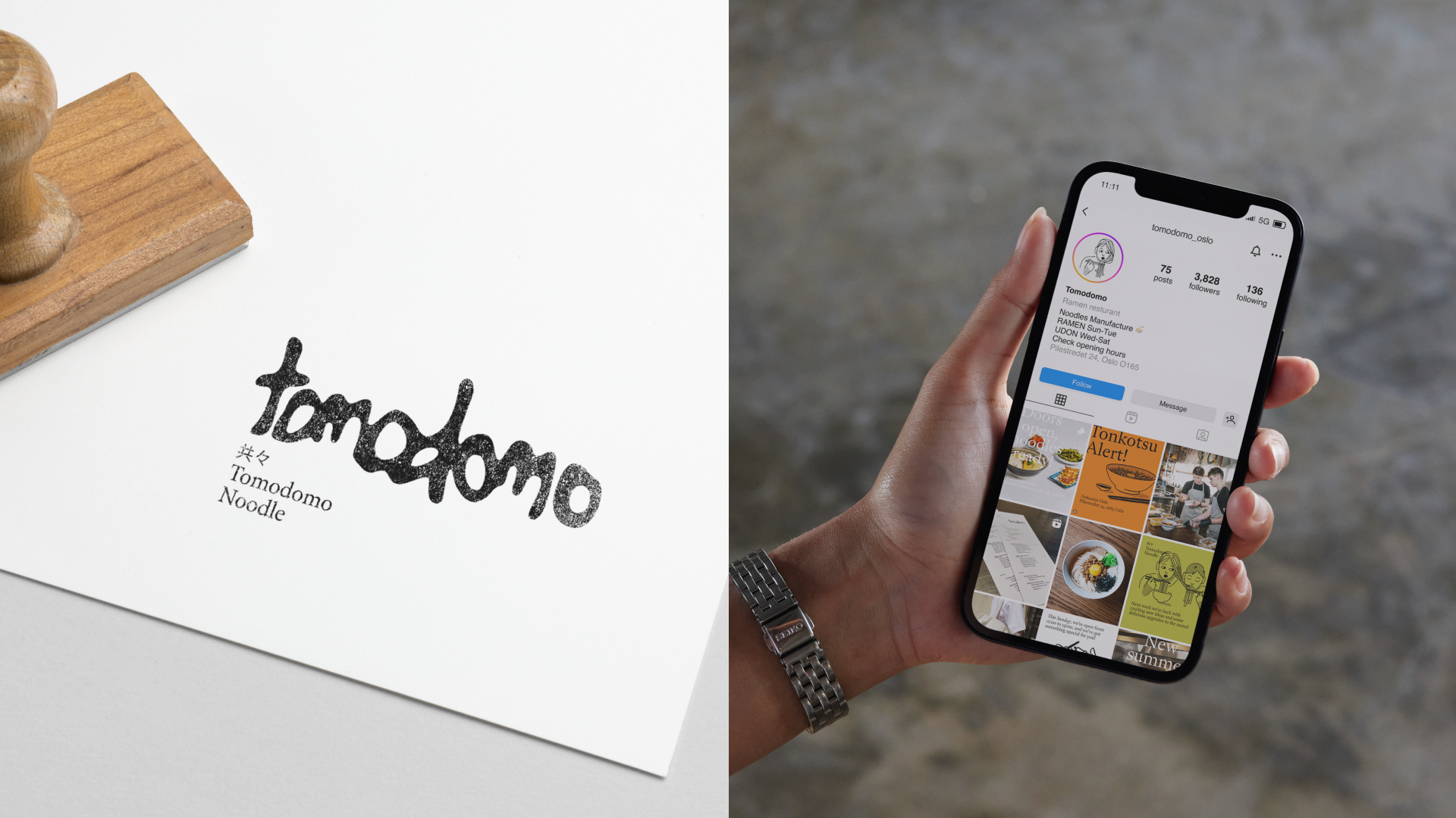
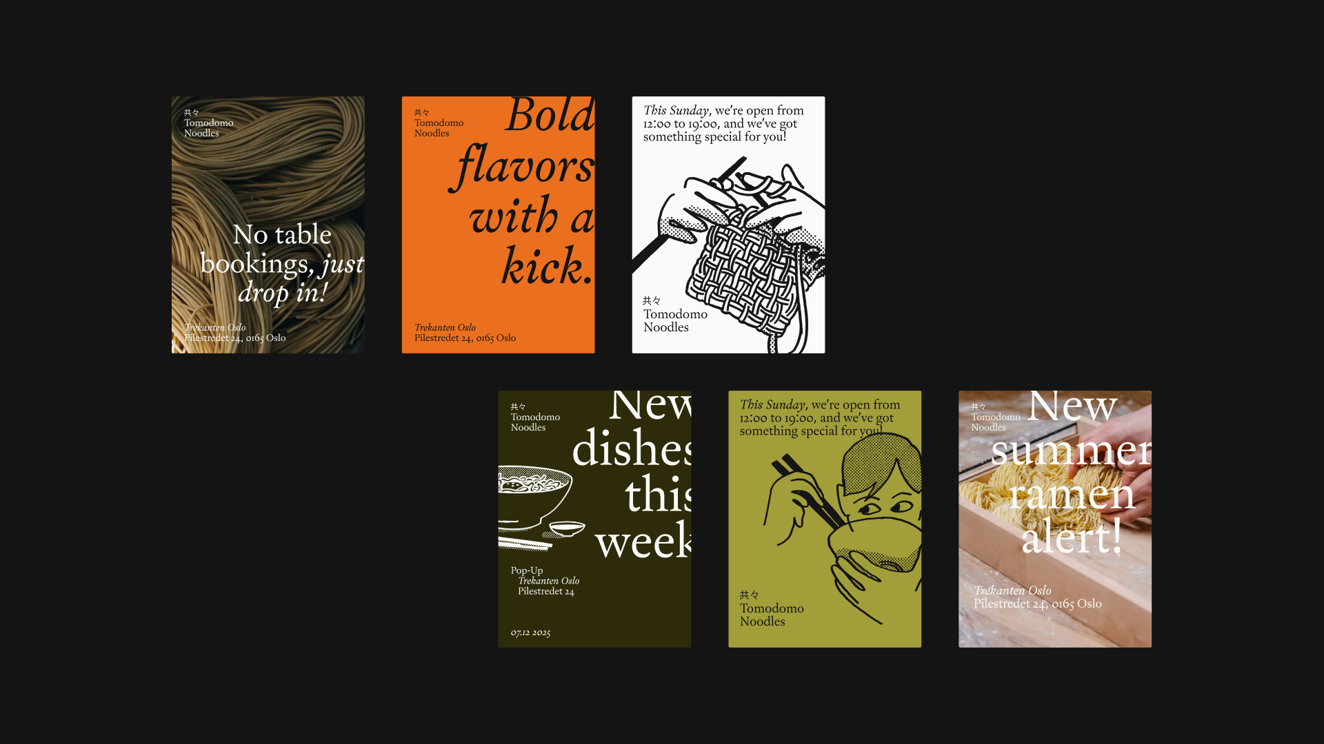
The identity we developed and it’s strength lies in the combination between elements; an organic logo resembling a broth stain, pairs with a classic typographic hierarchy for structure.
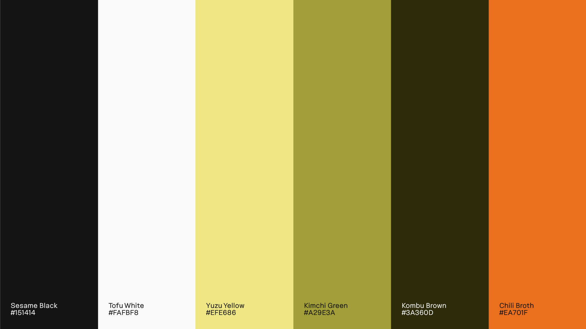
Earthy colours inspired by East Asian ingredients highlight the food’s sensory appeal, whilst the bespoke illustrations lead a cohesive visual language where every distinct, edgy element harmonises.
Earthy colours inspired by East Asian ingredients highlight the food’s sensory appeal, whilst the bespoke illustrations lead a cohesive visual language where every distinct, edgy element harmonises.
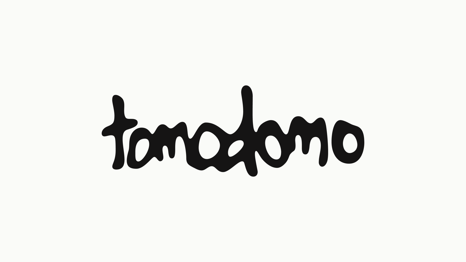
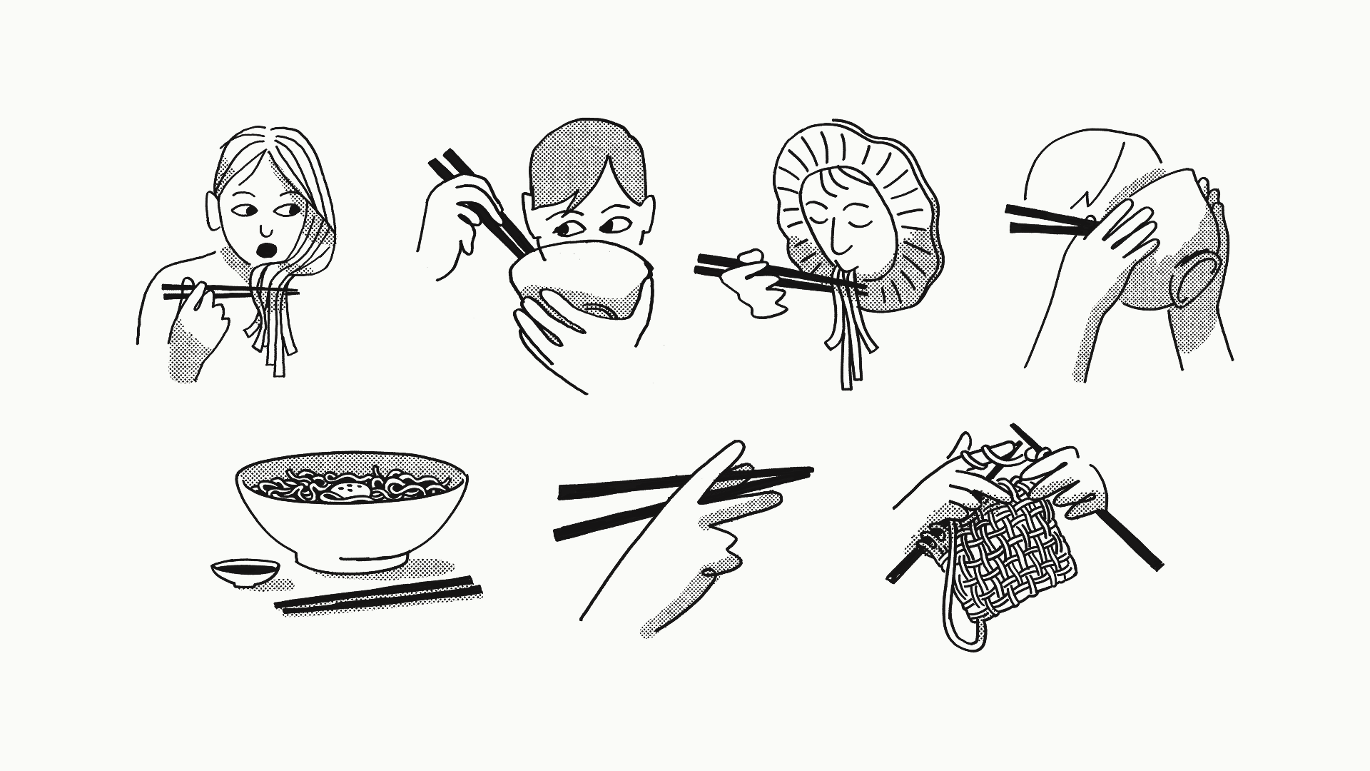
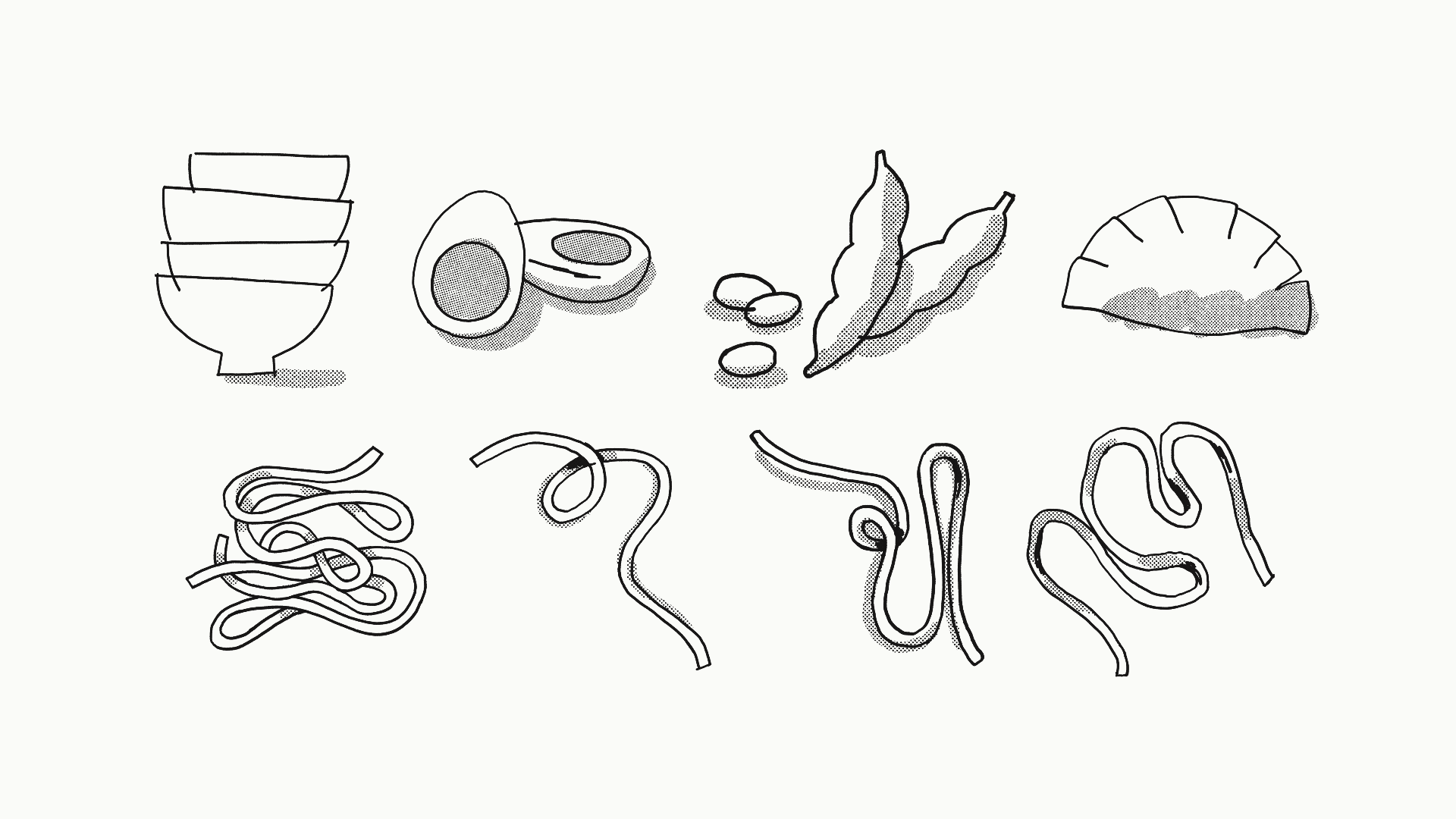
By putting weight on creating a set of bespoke illustrations to convey the human touch and artisanal craft at the core of the brand, it does not just become a visual expression - each hand-drawn line emphasises the raw integrity and passion the chefs pour into every bowl of ramen, soba or udon.


Credits
Illustration
Thea Glad
Design
Markus August Storsveen
Thea Glad
Erik Johan Worsøe Eriksen
Tobias Larsen
Motion Design
Thea Glad
3D Animation
Mads Hornsletten
Thea Glad
Design
Markus August Storsveen
Thea Glad
Erik Johan Worsøe Eriksen
Tobias Larsen
Motion Design
Thea Glad
3D Animation
Mads Hornsletten
Producer
Jennie Andersson Klemetsdal
Consultant
Kristin Eikeland Grimstad
Brand Strategist
Juliane Stensrud Mjåset
Web design
Martine Hage
Jennie Andersson Klemetsdal
Consultant
Kristin Eikeland Grimstad
Brand Strategist
Juliane Stensrud Mjåset
Web design
Martine Hage